Rob Hillier, Norwich University of the Arts – The Sylexiad Typeface
 Dyslexia is one of the most commonly diagnosed learning disabilities.
Rob Hillier, a graphic artist & lecturer at Norwich University of the Arts, has designed Sylexiad – a typeface that can help those afflicted with dyslexia.
Dr. Robert Hillier is a Senior Lecturer at Norwich University of the Arts. He designed and developed the Sylexiad range of fonts for adult dyslexic readers as part of his doctoral research. Hillier has presented his research findings at numerous design institutions and conferences, including the Design Principles and Practices Conference at University of California, Los Angeles (2012) and the Association Typographique Internationale (ATypI)) Conference in Reykjavik (2011). Sylexiad has been featured in publications including, Communication Arts, Baseline, Novum, Étapes, Slanted,  Ultrabold and the Journal of Writing in Creative Practice. A chapter about the typeface is also featured in the book Supporting Dyslexic Adults in Higher Education and the Workplace (2012). Sylexiad was included as part of the NEVERODDOREVEN exhibition at The Serpentine Gallery, London (2007). Hillier’s solo exhibitions include List Landscapes at The Norwich Arts Centre (2010) and Typologies. Making lists, marking time at the St. Bride Library, London. He has also exhibited work in the USA, Germany and South Korea and has won many information book design awards. His most recent project is “To-ing”, a self-authored book that is part of the Tate Special Collections at Tate Britain (2013). For more, visit RobsFonts.com.
The Sylexiad Typeface
![]()
Sylexiad is a family of fonts that was developed and tested to cater specifically to the needs of adult dyslexic readers. The typeface was produced through a series of reader tests called developmental typeface testing that measured the readability and legibility of numerous texts. Dyslexic and non-dyslexic readers were asked to respond those texts set as individual characters, words, sentences and paragraphs. The fonts used during the testing process included Arial, Times New Roman and formative versions of Sylexiad set in different sizes.
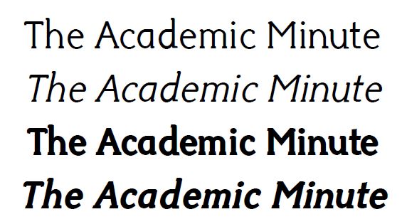 The findings identified the typographic characteristics adult dyslexic and non-dyslexic readers preferred and why. For the majority of the non-dyslexic readers tested, it was the combination of serif-style structure, lowercase forms, large x-heights, medium weight, variable strokes and normal inter-word spacing that was preferred. The non-dyslexic readers also favoured the design of Times New Roman. Conversely, for the majority of the dyslexic readers tested, it was the combination of handwritten typographic styles, uppercase forms, long ascenders and descenders, light weights, uniform strokes, perpendicular letter design and generous inter-word spacing that was preferred. The dyslexic readers also favoured the form of Sylexiad Serif.
Most typefaces are tested for readability and legibility after they have been designed. The design of Sylexiad is unusual in that the testing for readability and legibility was undertaken during the actual design process. Sylexiad was therefore informed and modified by reader feedback as the testing progressed. The testing has raised issues that both confirm and contradict current typographic principles of legibility. Most notably, from a dyslexic perspective, the idea that we read words as shapes has been challenged. Since designing Sylexiad in 2006, the font has been used throughout the world and it forms a key visual element within my own artistic and design practice.

-
 Ursula Lauper, University at Albany – Rise in Legionnaires’ Disease
On University at Albany Week: Why is legionnaire’s disease on the rise? Ursula Lauper,
Ursula Lauper, University at Albany – Rise in Legionnaires’ Disease
On University at Albany Week: Why is legionnaire’s disease on the rise? Ursula Lauper, -
 Matthew Landry, University of California, Irvine – Misconceptions and Gaps in OB/GYN Training on Plant-Based Nutrition
Not enough doctors are trained in plant-based nutrition. Matthew Landry, assistant professor of population
Matthew Landry, University of California, Irvine – Misconceptions and Gaps in OB/GYN Training on Plant-Based Nutrition
Not enough doctors are trained in plant-based nutrition. Matthew Landry, assistant professor of population